So Good You Can Get Toucans.
Brand identity for a tropical, health-conscious smoothie brand built for active young adults.
Brand Identity, Graphic Design, Logo Design, Social Media
INSIGHT
Beyond the Tropics.
Oi Smoothie is a bold, health-conscious brand for active young adults who crave adventure and wellness. Blended with premium South American fruits, Oi delivers tropical flavor and fresh convenience for busy lifestyles, making it the perfect go-to for those always on the move.
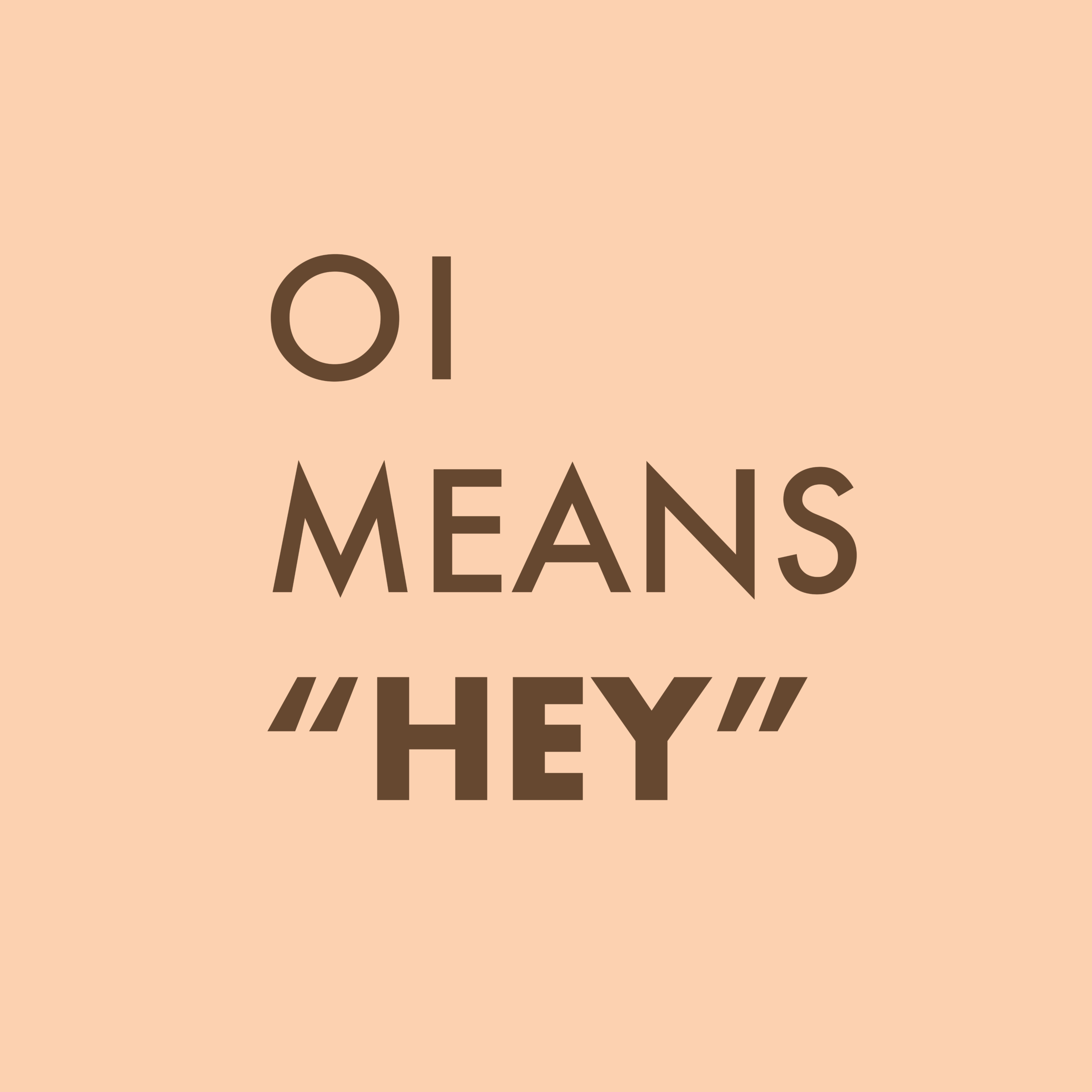
Oi There!
The name “Oi” comes from the Portuguese word for “Hey”. A friendly, attention-grabbing greeting. It reflects the brand’s vibrant and welcoming spirit, bringing energy, personality, and a playful spark that matches the amazing flavor.
IDEA
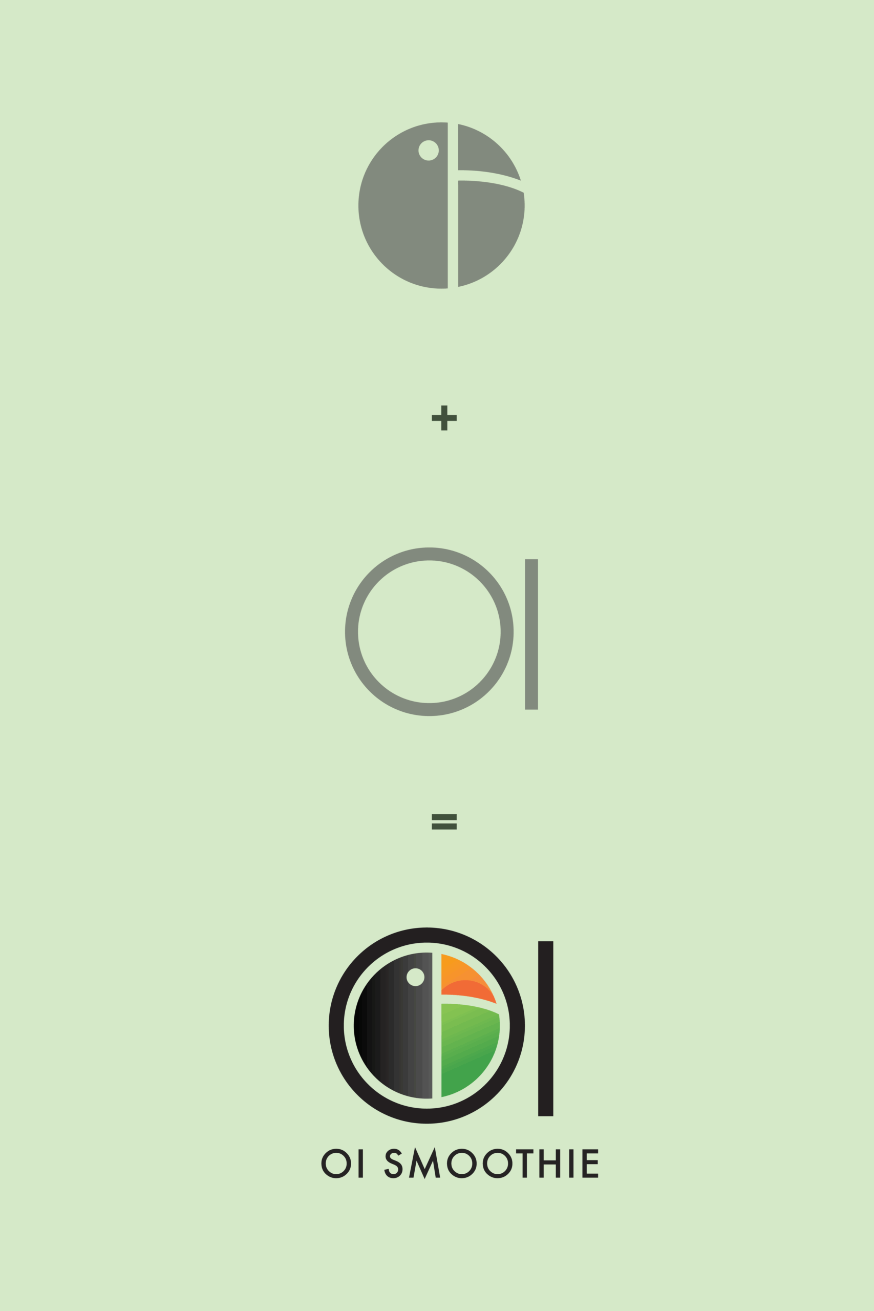
Hey, Meet The Mark
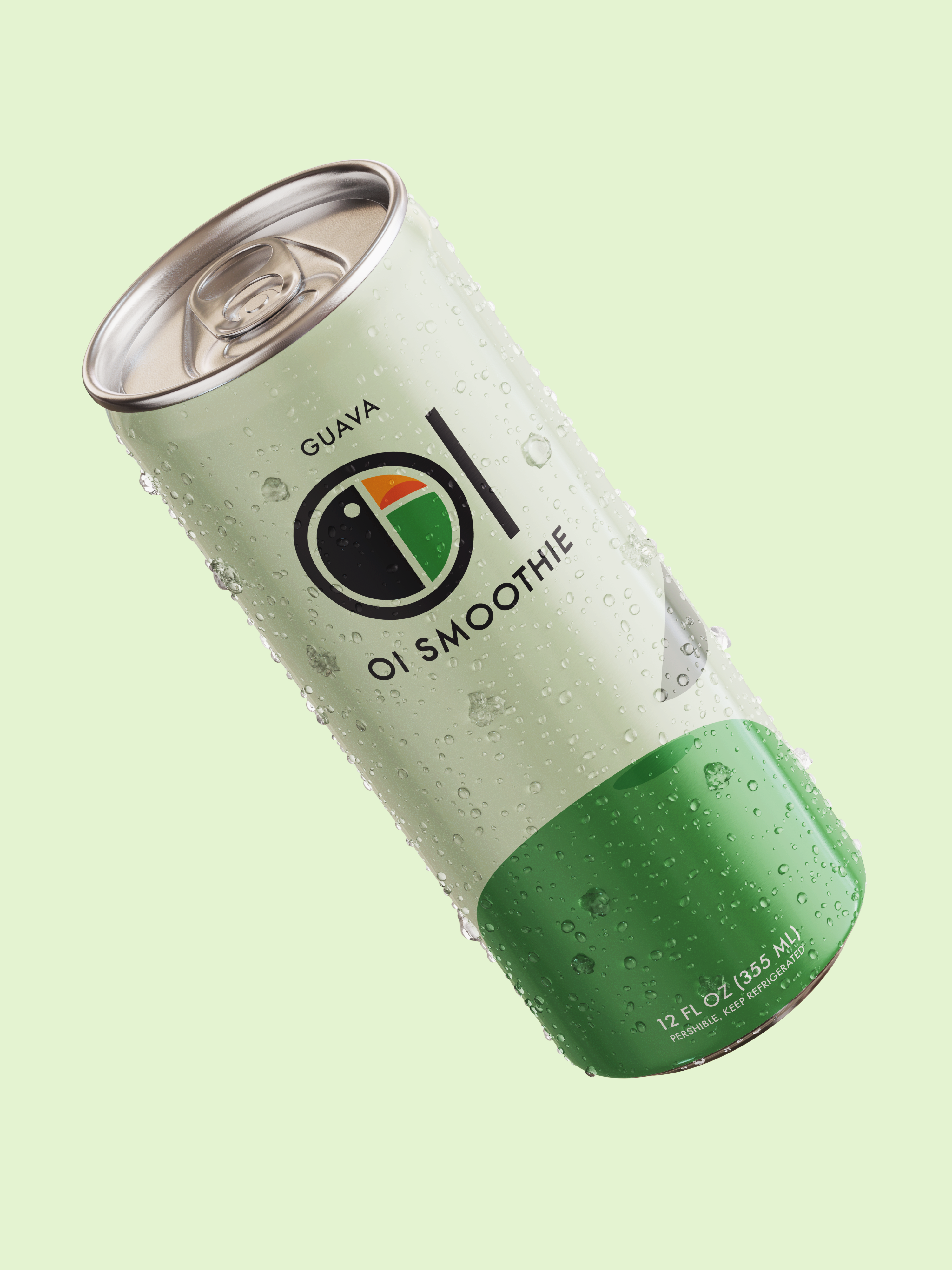
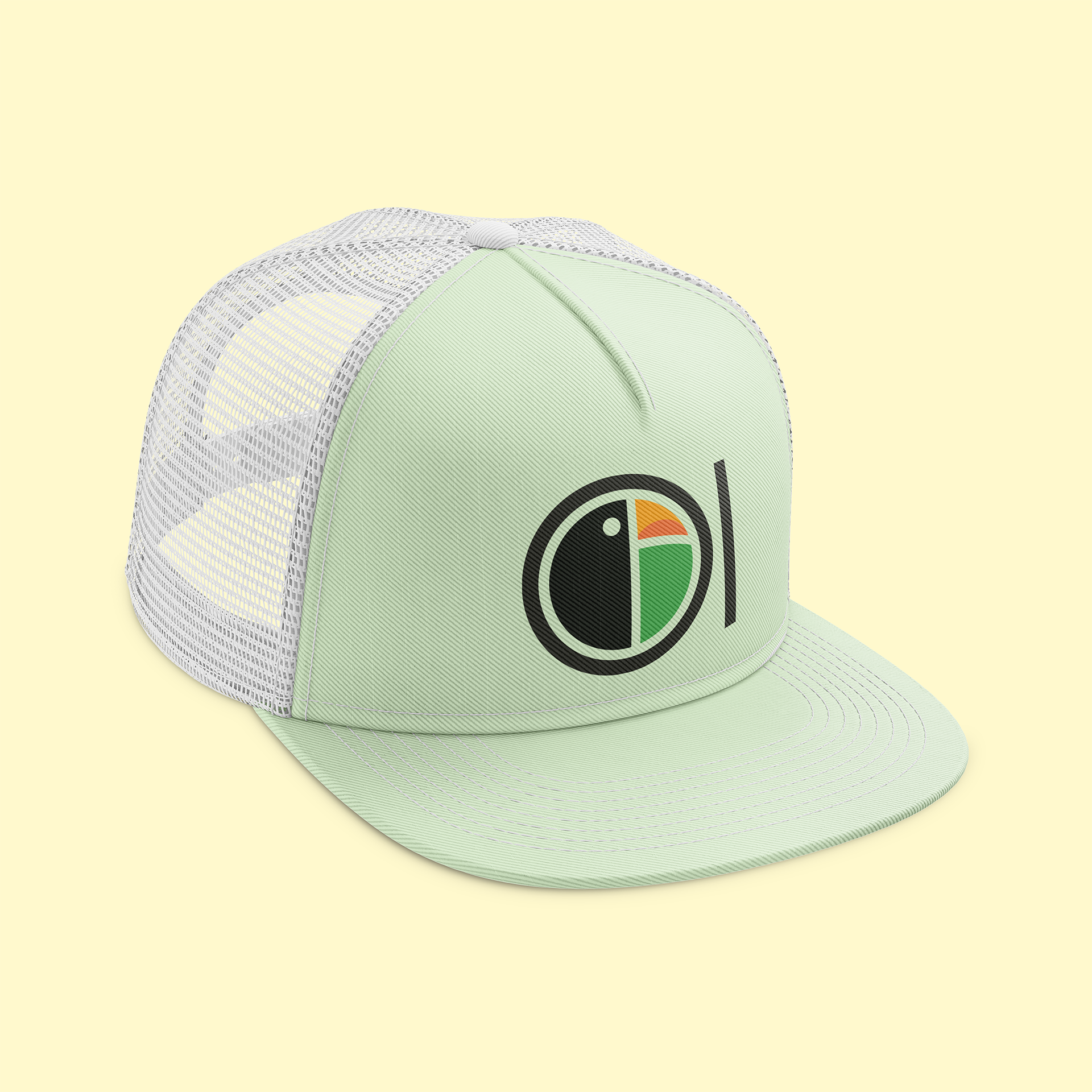
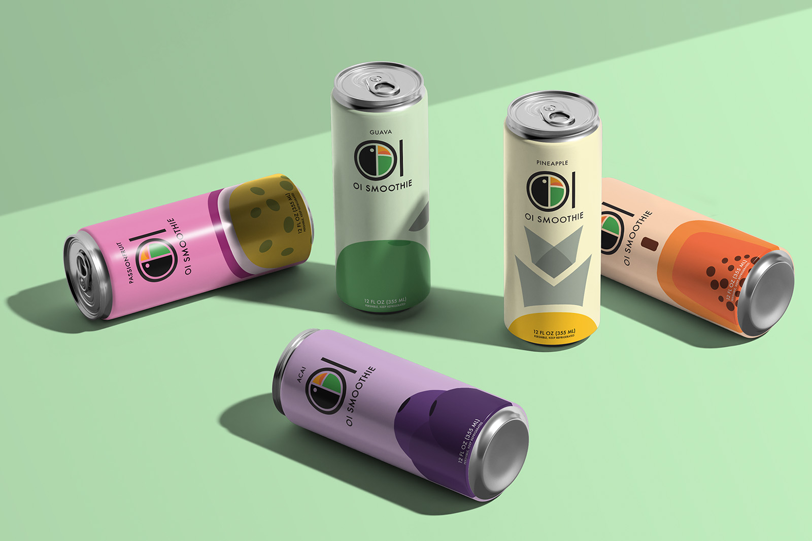
The Oi Smoothie logo blends bold letterforms with tropical personality by turning the capital “O” and “I” into the shape of a toucan. The “O” holds the shape of the bird’s head and body, while the “I” stands tall beside it, completing the name and the visual. This playful fusion captures the brand’s fun and young energy in a simple, striking mark.
And if you look closely enough… you might just spot the hidden “O” and lowercase “i” hiding inside the toucan itself. Sneaky, right?
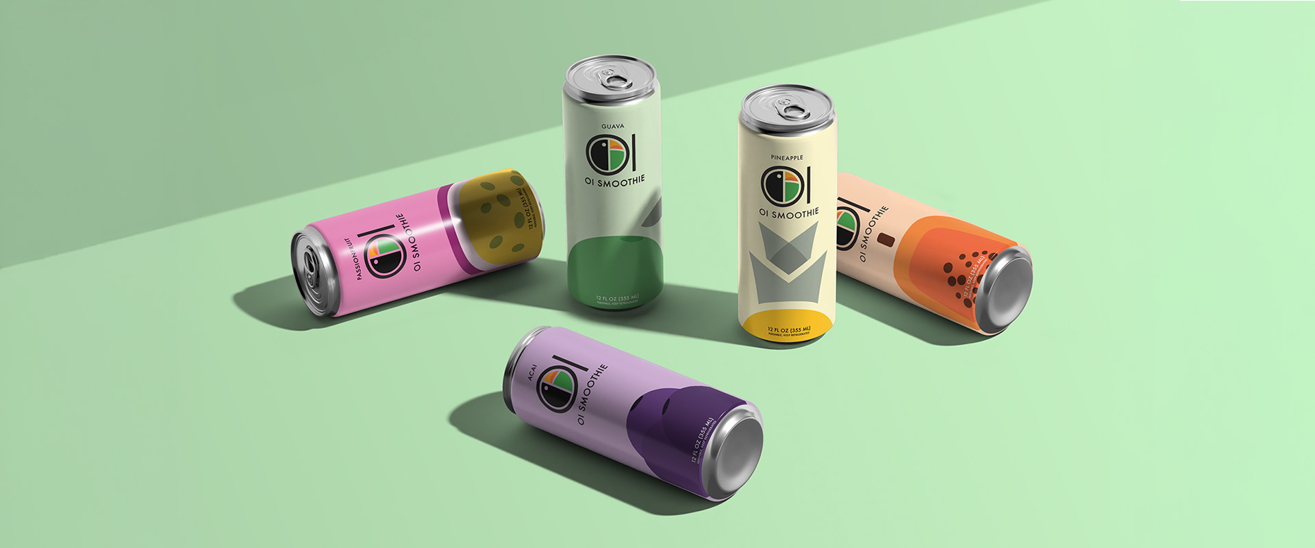
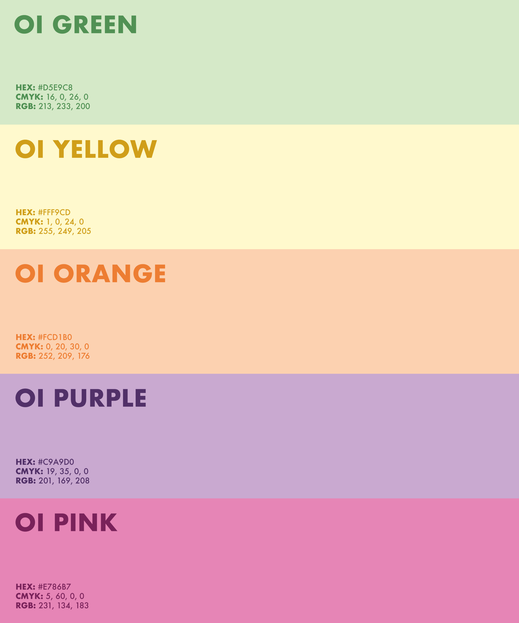
5 Colors 5 Flavors
The color palette captures the essence of five tropical fruits, using tones that are light, slightly muted, yet still full of life. Each shade reflects the fresh, flavorful personality of Oi Smoothie. Fun, welcoming, and easy on the eyes. This soft vibrancy helps the brand feel approachable and energizing, like a laid-back sunny day.
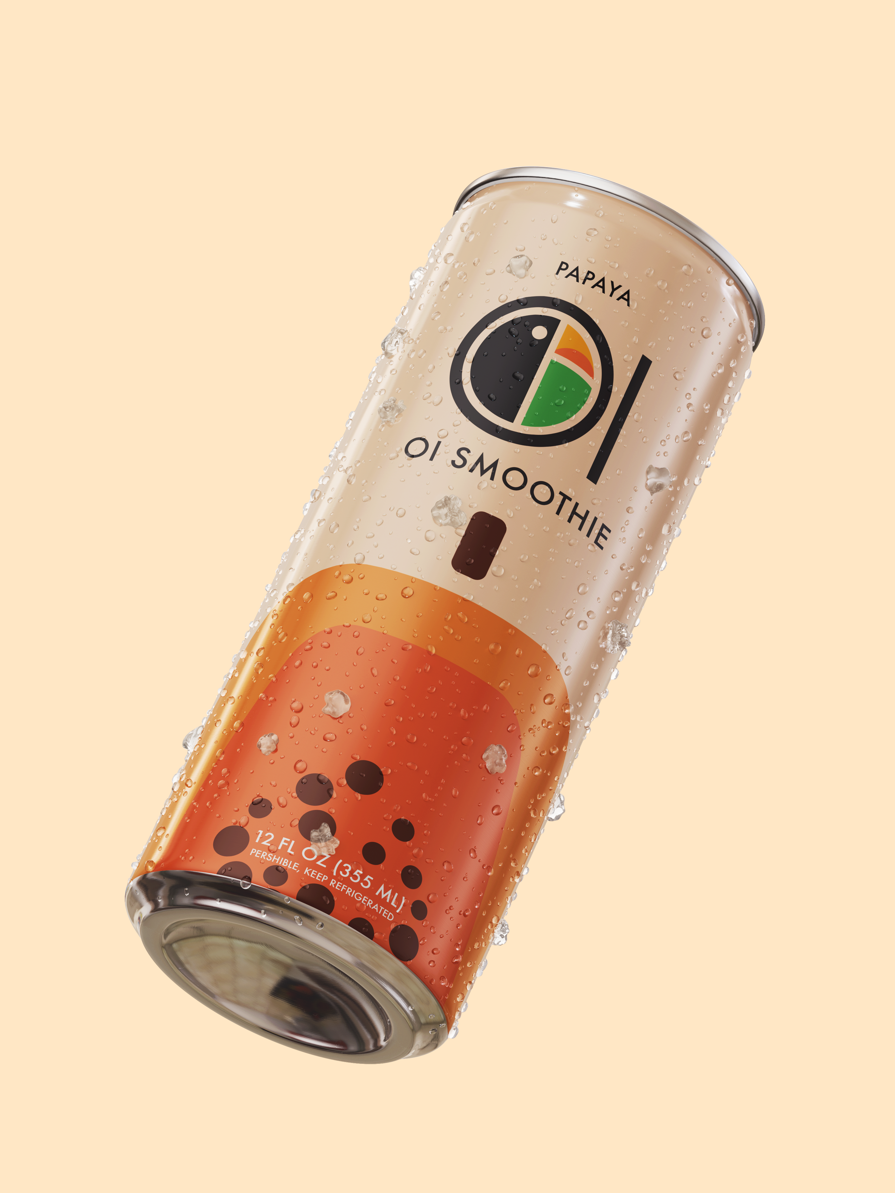
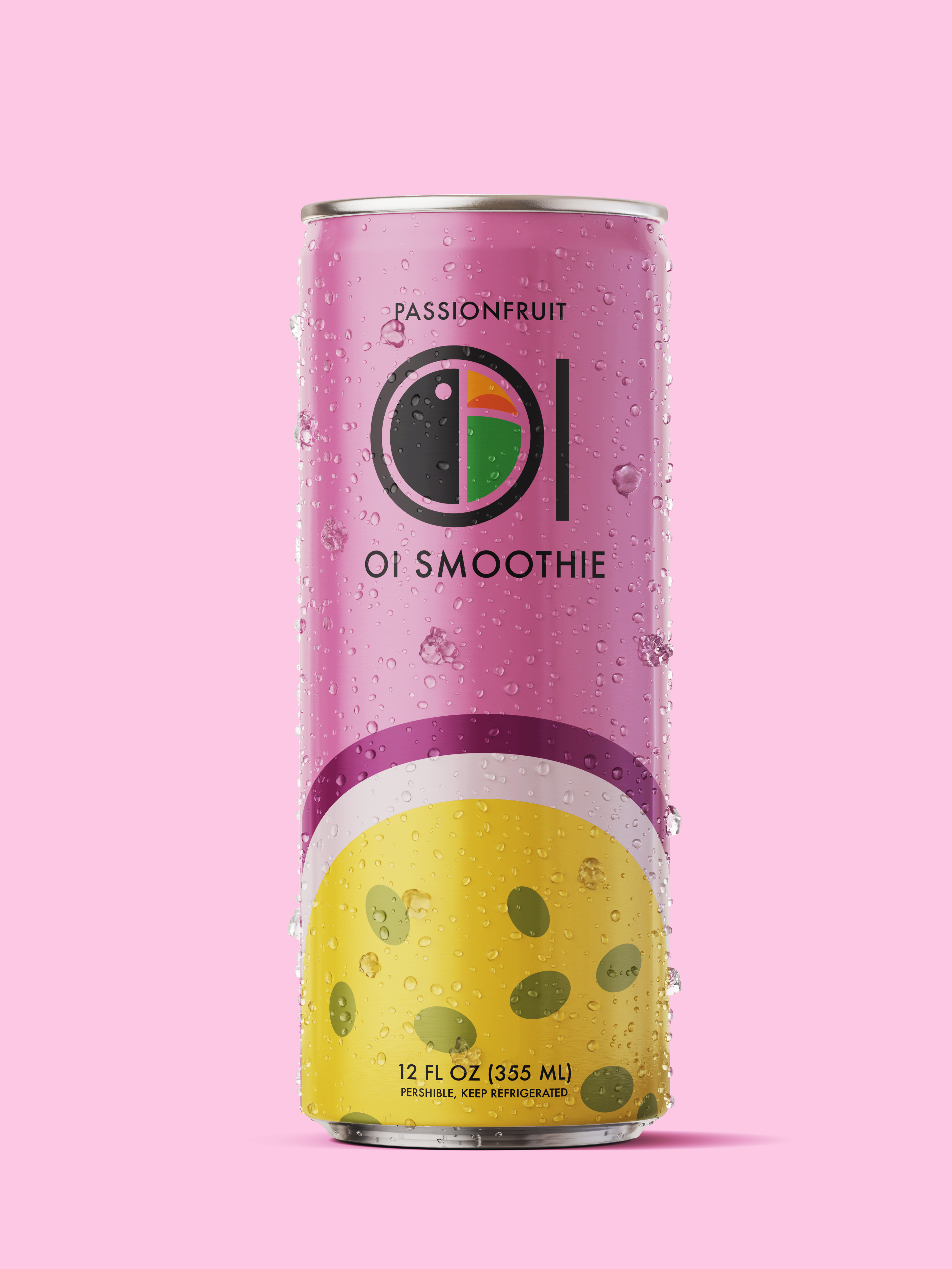
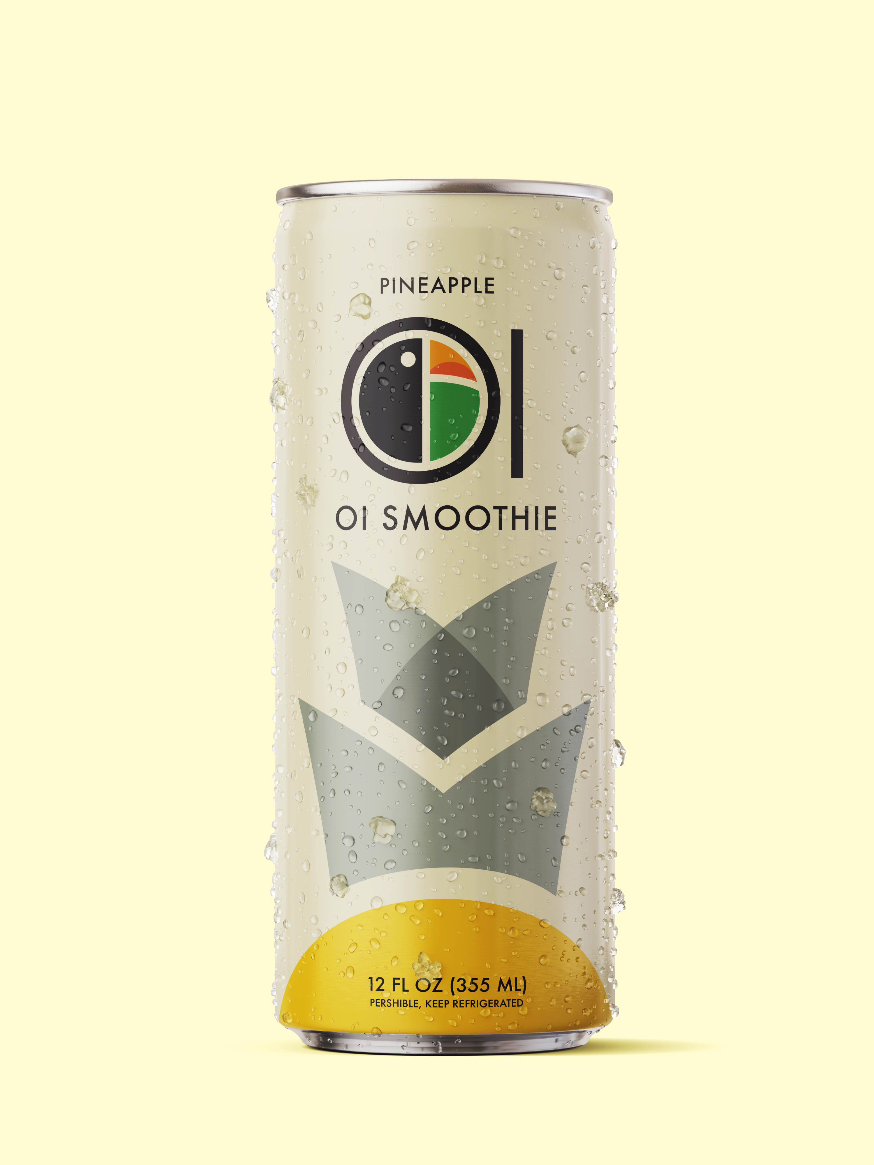
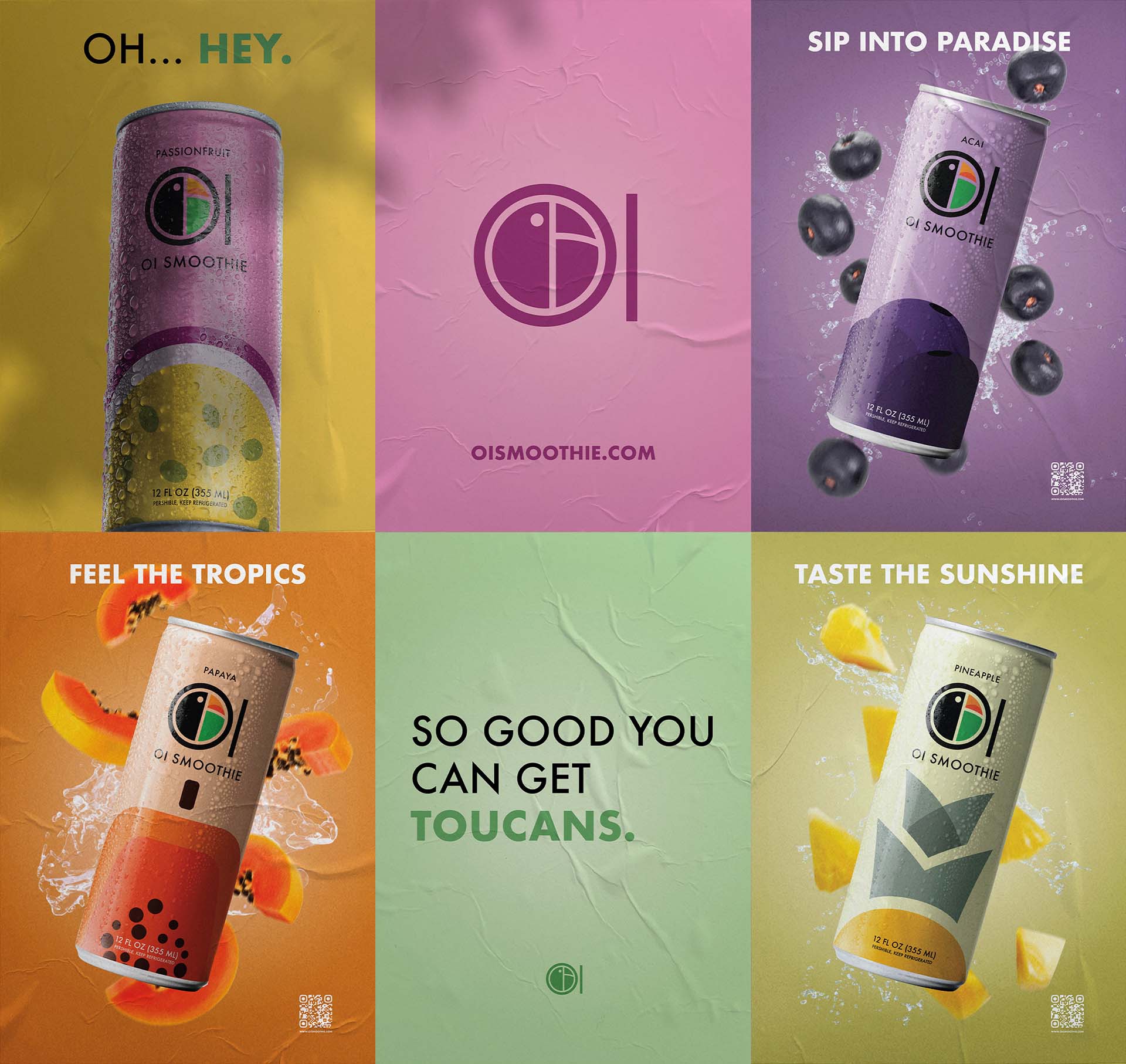
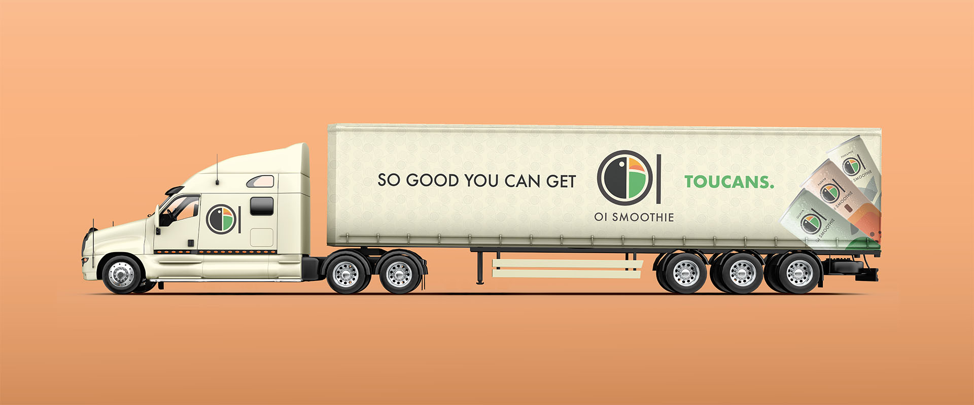
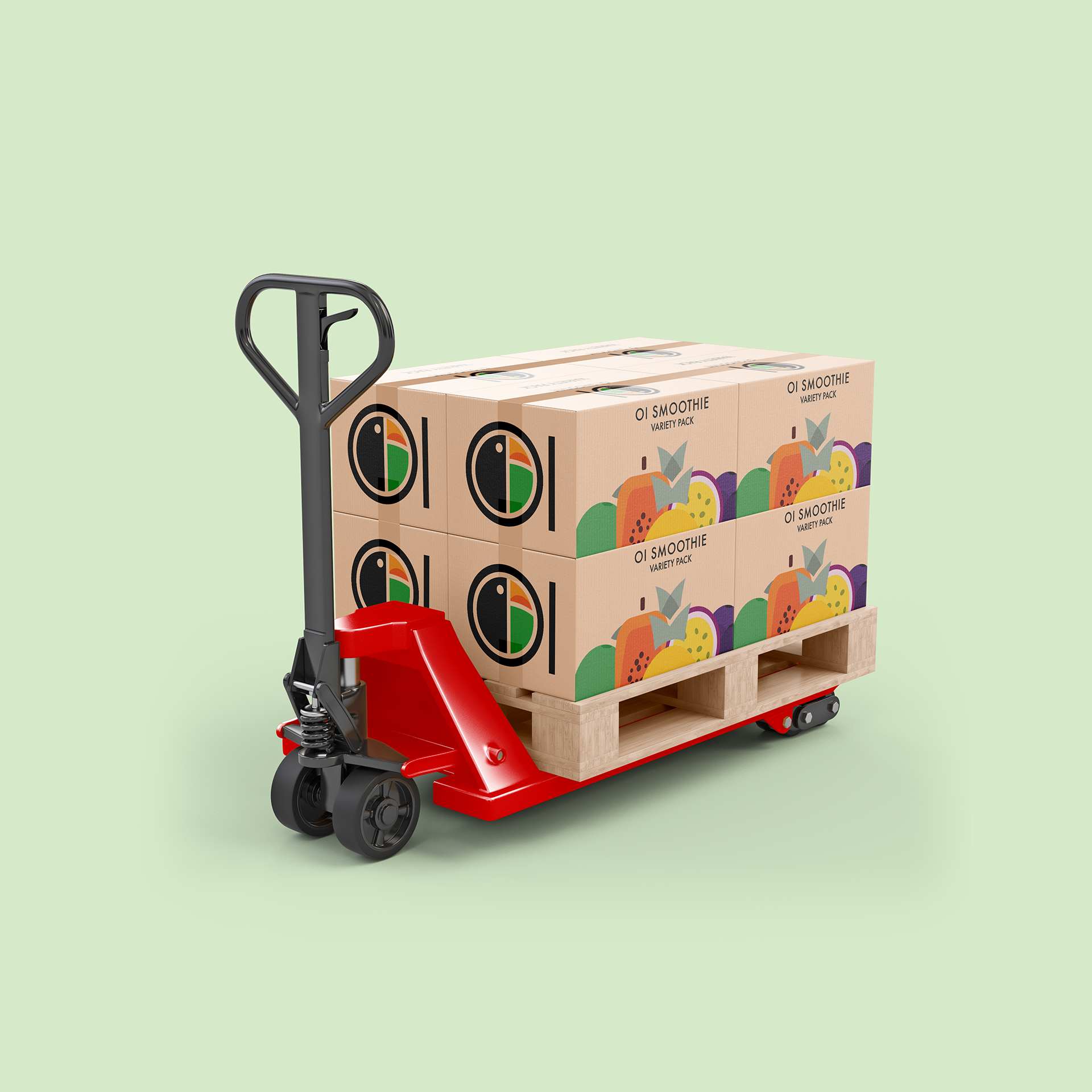
Packaged with Personality
From shelf to street, its bold colors and forms scale effortlessly across packaging and vehicles, spreading tropical energy wherever it goes.


Selected Works

PANDA AirlinesBrand Identity
70th Grammy AwardsBrand Identity
Oi SmoothieBrand Identity

Josiah Grant Visual IdentityLogo Design

HOW Chicago 2025Brand Identity
Doritos Super Bowl LIXPoster Campaign
BOLD. QUALITY. STORYTELLING.